How the BLACK collection came to be:
the northern lights without colour
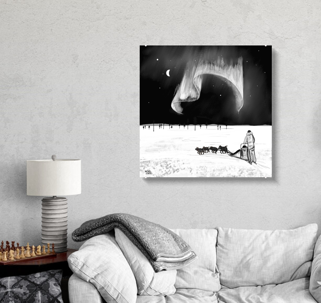
How do you draw the northern lights in black and white? It sounds like a riddle. For me, it was a wonderful project with a real challenge, and it took a lot of preparation. It became my darkest, most graphic series.
It grew into much more than the northern lights alone: a castle in the Highlands, a bridge in the moonlight, cherry blossom against a Norwegian stave church, puffins in the wind. Every piece shares the same signature: shades of black and a single, carefully chosen touch of colour.
A request I didn't see coming
One summer, I was drawing three custom works for the new sky view cabins at The Northern Lights Ranch in Finnish Lapland. My first versions were in colour. Of course they were: I had spent winter after winter up there, under green skies and pastel polar nights.
Then the Ranch asked if I could make them black.
My first thought was: oh help. I don't draw in black and white. Colour is how I think.
But their reasoning was beautiful, and the longer I thought about it, the more I agreed. In a cabin with a glass roof, the colour comes from outside: the green of the aurora, the soft pinks and blues of the polar night, the white of the snow. The art on the wall should support that view, not compete with it. Colour is what you find outside.
First attempt
Pure black and white felt soulless
For the Ranch drawings, I did what seemed logical. I started completely from scratch and redrew them in pure black and white.
The result was technically correct, but completely lifeless. A black sky with a white aurora. Flat. Nothing glowed.
White can sparkle against a dark sky, but this sketch had none of that sparkle. It needed shades of grey and halftones. Just as the northern lights make the sky glow, I wanted the same glow and depth in this black version. I just didn’t know yet how to get there.
The aha moment
An old, forgotten trick
Then I remembered a few experiments from years ago, back when I didn’t even have a drawing tablet yet.
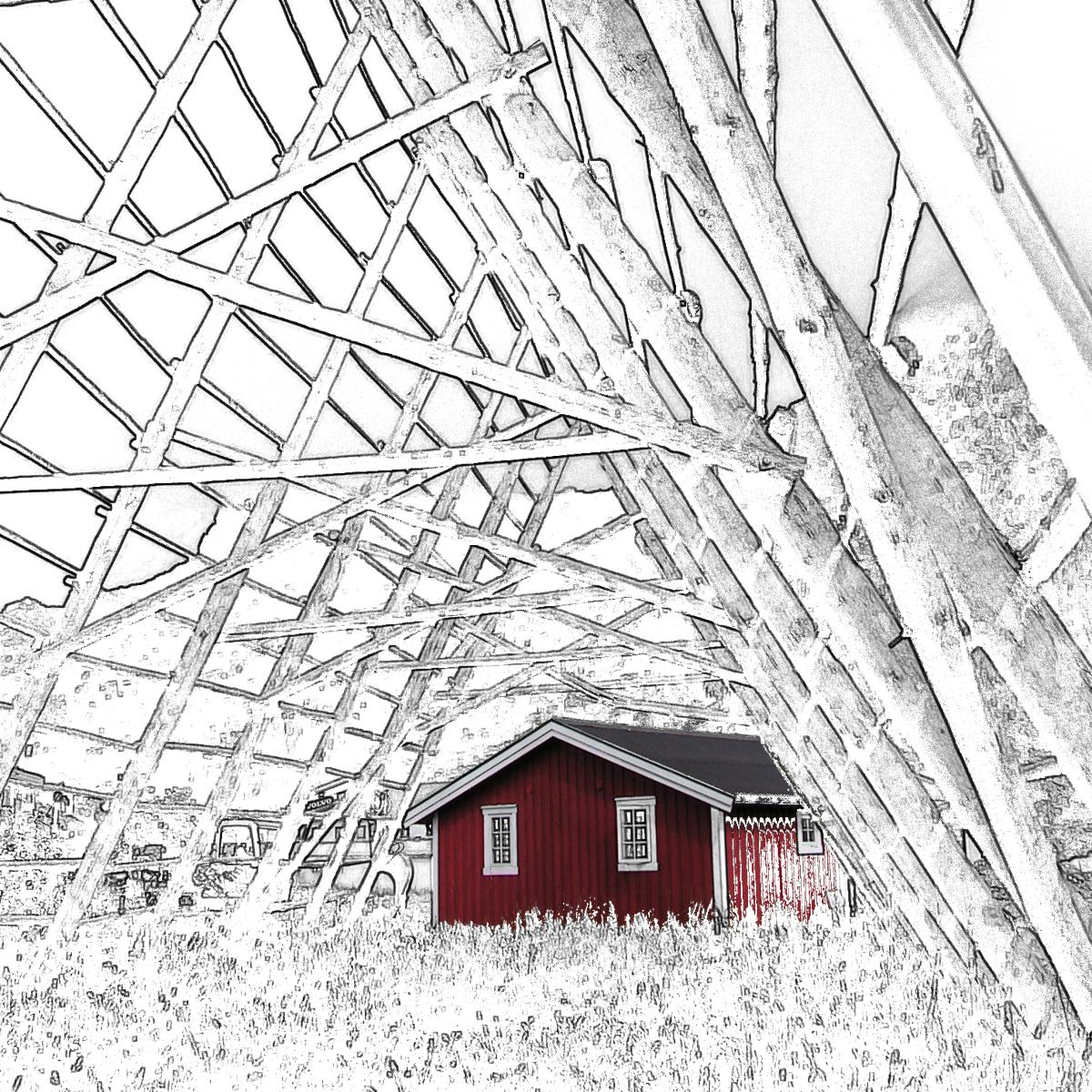
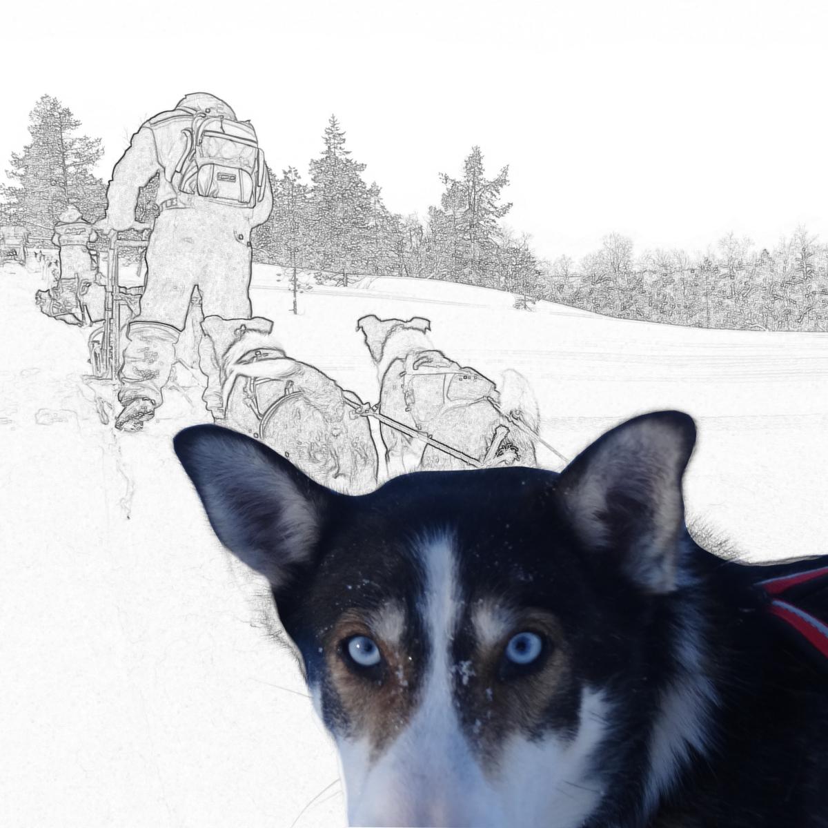
Back then, I’d take my own travel photos and edit them in GIMP: lowering the saturation, adding colour, and playing with the settings until a colour photo looked like a pen-and-ink drawing. A red fisherman’s hut beneath the stockfish racks on the Lofoten Islands. A harbour cabin and a husky looking straight into my lens, from a trip to Malangen in Northern Norway.
That forgotten trick turned out to be the missing piece. Instead of redrawing the Ranch works in black, I could take the colour versions I already had and convert them. Because every layer started out in colour, the greys kept their depth. The green of the aurora was filtered out, but what it left behind was anything but flat.
The preparation
This is how it all began: Reindeer & Northern Lights
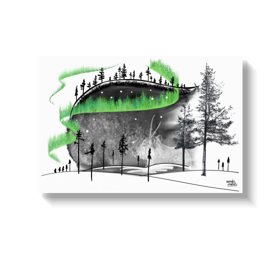
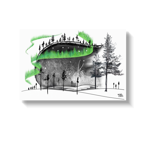
So I started sketching. One of those sketches was a sleeping reindeer under the northern lights, drawn in black ink. It worked: this sketch became the basis for finishing the pieces for this client. Somewhere along the way, a green streak did sneak into the sky. I simply had to put my colour somewhere. That sketch became the first piece of the BLACK collection, and its aurora still shines green. Whether that green could stay, I never doubted for a second. In hindsight, that streak set the tone for everything that followed: black, plus one colour that earns its place.
Not truly black & white
Why the sky is never black
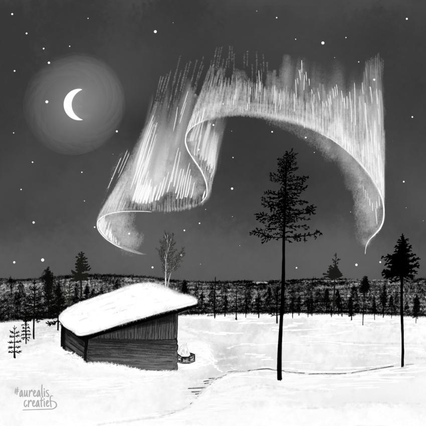
Desaturating isn’t the end, it’s only the beginning. After the conversion I go back in with my drawing pen and build the light by hand: a few white streaks until the grey aurora glows again, glowing rings around the moon, stars scattered across a deep blue-black sky, just light enough for the pine trees to stand out against it.
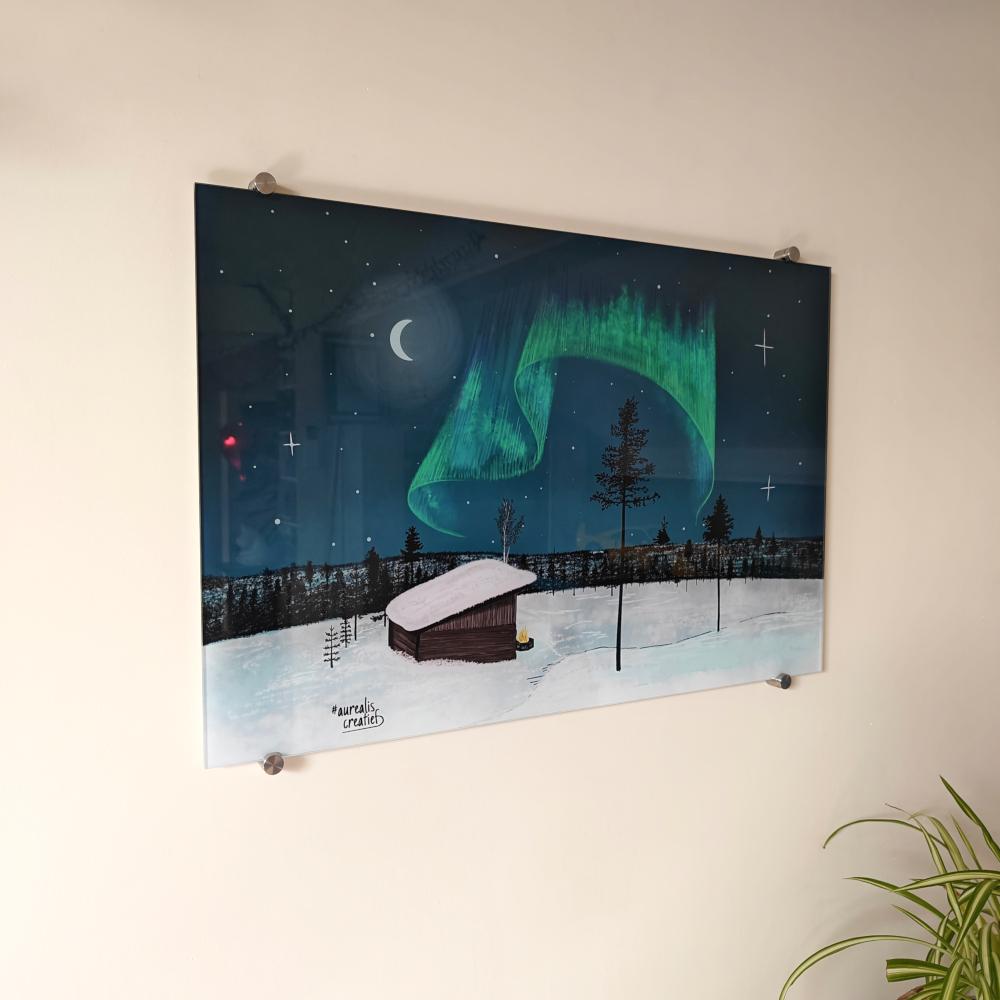
So the final Ranch pieces aren't truly black and white. They are colourless colours: soft clouds, a dark sky with a radiant aurora, depth instead of hard contrast. This one hangs in the seating area of every sky view cabin at the Ranch, on 30 × 30 cm acrylic glass. At home, the colour version hangs on my own wall at 40 × 60 cm. Same drawing, two moods.
The collection
From the Arctic to a Scottish bridge
I thought it would stop with the custom project. Until a private collector saw the works at the Ranch and asked for her own collection: four pieces for her walls, in the same style.
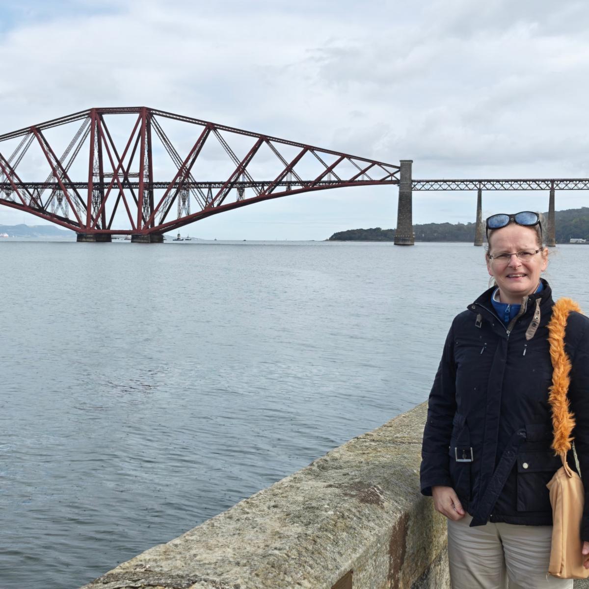
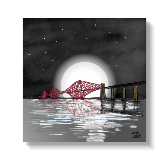
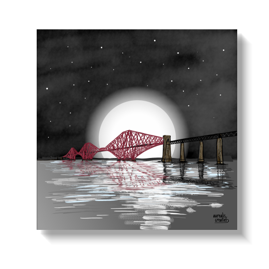
Around the same time, I was planning a trip through Scotland, and while looking for places to stop off along the way, I came across the Forth Bridge. It intrigued me so much that it was already on my drawing tablet before I’d even set off. That first version was in colour, but I just couldn’t get the water right. It lay waiting for a few weeks. Once the works for the collector were finished, I picked it up again and turned it into a night-time scene, with a huge full moon and the bridge in red. The story of that bridge has its own page (coming soon).
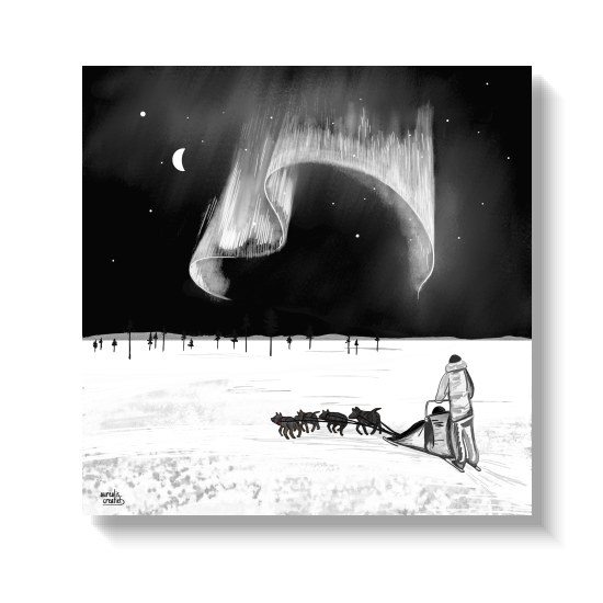
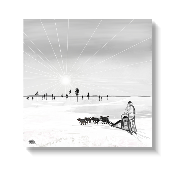
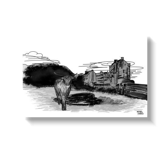
After the bridge came the huskies, and after that, the collection grew on its own: 'Reindeer & Northern Lights', 'Aurora Hunting', 'Skating Through the City', 'Puffins on the Wind', 'Highland Cow & Castle' and 'Stave Church & Cherry Blossoms'. Different places, the same signature.
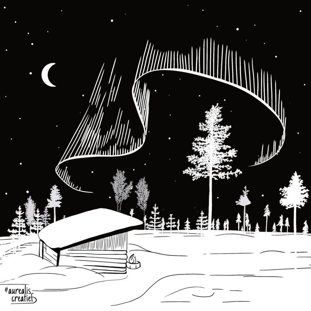
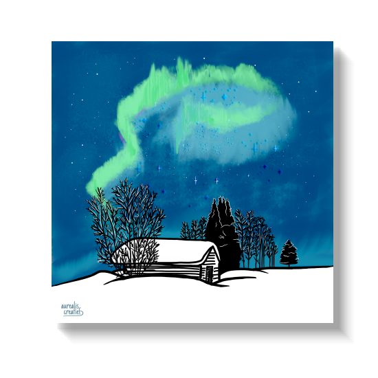
Even our own home found a place in it. ‘Winterwonderland - Aurora’ is the little log shed behind our yellow house near Tepasto, beneath the northern lights. You might recognise it from First Snow, where it appears in full colour.
The Forth Bridge
Two ways into black
Not every BLACK work is created in the same way, and if you look closely, you can see that.
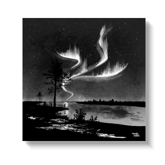
Some works were originally in colour and were subsequently turned black, such as the Ranch works, 'Forth Bridge' and 'Aurora Hunting'. They possess that layered depth which is characteristic of the old technique.
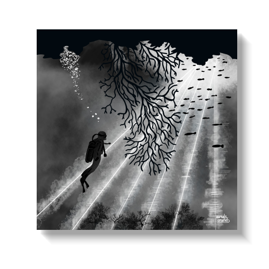
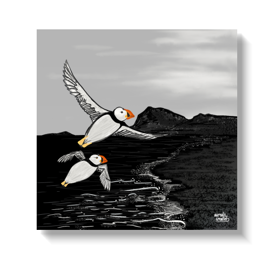
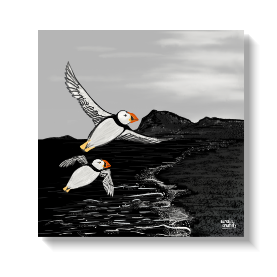
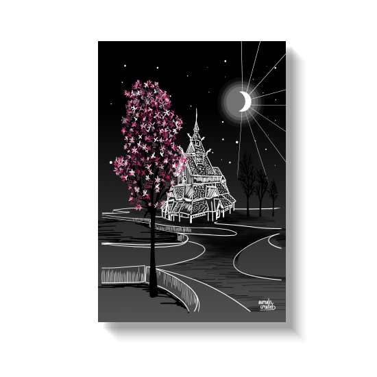
Others I drew in black from the very first line: 'Puffins on the Wind', 'Highland Cow & Castle' and 'Stave Church & Cherry Blossoms'. For those works, I switched straight to a palette of black and grey tones on my drawing tablet. They are sharper and more graphic, with less hidden depth beneath.
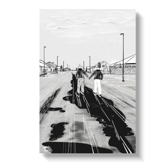
And sometimes I mix the two. In 'Skating Through the City', the sky and the ground retain a hint of colour, applied with an airbrush that adds soft colour gradients.
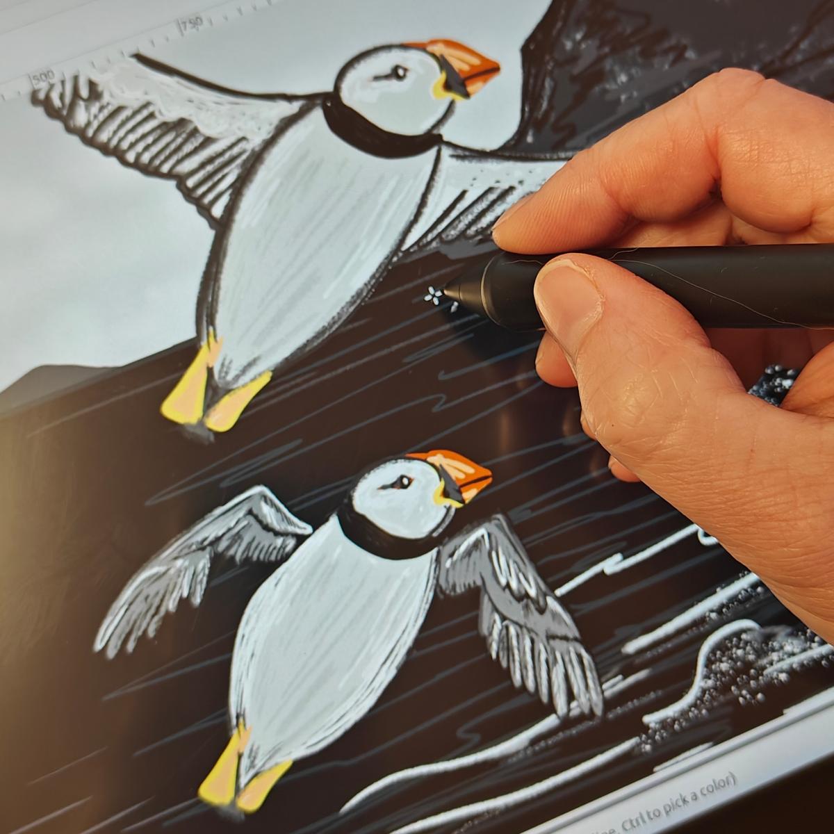
Everything in the current collection has been drawn in GIMP on a drawing tablet: a pressure-sensitive pen, a brush or an airbrush, depending on the layer, and smudging to soften the light. The desaturation trick is still there. It’s an old technique in a new style.
A touch of colour
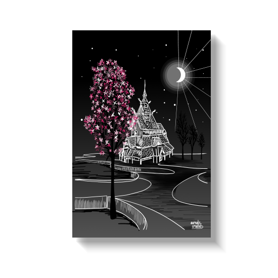
One colour, chosen by the piece itself: orange for the puffins, pink for the blossoms.
1 colour
Where the one colour goes
How do I decide where the colour ends up? Usually not in advance. The work tells me. The puffins needed their orange, the cherry blossoms their pink, the Forth Bridge its red. Without that colour, they would have been lovely drawings. With that colour, they really shine.
Other works have never been given an extra colour, and that, too, is a choice. Many BLACK works are landscapes, a window onto a place. A single colour draws your gaze to one detail, and in a vast landscape I prefer to keep the whole window open. For me, that’s also the difference between Nordic and Scandinavian art: first the landscape, then the detail.
Why "BLACK" and not "black and white"
Because there’s no pure black in it. I never use the solid black of a screen (#000). Every dark area is a shade of black, a variation that creates depth. And it’s not black and white either: it’s black and orange, black and red, black and green. It starts with black; the colour, if it comes, brings out the detail.
The memories behind the drawings
Behind each of these works there is a real memory.
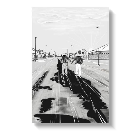
'Skating Through the City' dates from the first winter I spent back in Belgium after my years in Lapland. One morning, the streets were so slippery that we were literally skating during our morning walk. The houses in the drawing are real: a street in our own village, covered in a slippery layer of snow and ice.
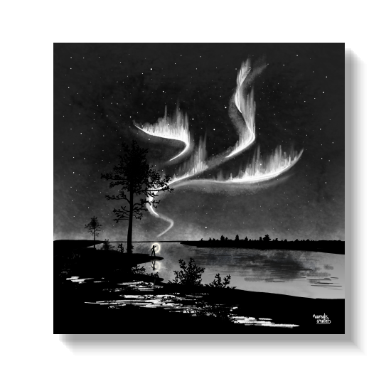
'Aurora Hunting' is about one of the many nights we went hunting for the northern lights ourselves: head torch in hand, trudging through the snow to reach the water’s edge, while the northern lights danced above our heads. That drawing was originally in colour, but I’ve converted it to black.
'Stave Church & Cherry Blossoms' brings together two places that have never met: a cycle path lined with blossom near where I live, and a stave church being built in Norway in the traditional way. Read how they came together [soon available].
Two memories
Two days, two memories: an icy village street at home, and a river in Lapland under the aurora.
What black gives me that colour doesn't
Freedom, strangely enough. A black piece is difficult to draw. There’s nowhere to hide, and every shade has to be just right. But thanks to years of drawing and digital experimentation, I can create something here that a camera cannot.
Photographers take thousands of photos of the Forth Bridge. None of them can place the bridge beneath such a large moon. I can. I decide where the moon is, how big it is, how the light falls across the water, and exactly which shade of red makes the steel stand out against the night. Black gives me control over the light, and with it, control over where your gaze is drawn first.
There’s also just pure enjoyment in it. When I desaturate a colour drawing, I never know exactly what the result will be. The software gives me a starting point; my pen does the rest. That moment of surprise is still my favourite part.
I’ve tapped into something I’d forgotten I was capable of: the old-fashioned photo editing I first experimented with long before I owned a drawing tablet. An old trick applied in a modern way and finished by hand.
Who knows what’s next
I honestly don’t know, and I like it that way. What I do know is that BLACK will travel further than Lapland. Easter Island is on my list. And somewhere in a folder lies a little round-the-world trip from A to Z, one country per letter, which I drew during lockdown but never published. Some of them deserve to be redrawn in black. A different, more exotic direction, and still with one touch of colour.
Bring BLACK home
Discover the BLACK collection
Every BLACK artwork is available as acrylic glass, a metal plate or an art block.
Discover all Black works in the shop
Would you like a place of your own in black, with one touch of colour? That is exactly how this collection began: with a custom request. Tell me about your place.
More stories behind my illustrations: The Story Behind every illustration
Frequently asked questions
Are the BLACK works pure black and white?
No. They are composed of shades of black and grey, never solid black, which gives the sky and the snow their depth. Most works feature a single deliberate accent colour; some, particularly the sweeping landscapes, have none at all.
Can I commission a custom illustration in the BLACK style?
Yes. BLACK itself began with a custom request. You tell me about a place that matters to you, and together we decide whether it gets an accent colour, and which one. Read more about custom art
Does black and white art work in a colourful interior?
Yes, often better than a colourful print. Black and white art doesn't compete with the colours already in a room; it gives the eye a calm place to rest. The single accent colour in most BLACK pieces lets you tie the artwork to your interior: a red, orange or green that echoes a cushion, a chair or a plant.
Which material is best suited to black-and-white wall art?
For night scenes, acrylic glass gives the deepest blacks and makes the white highlights glow; it is the material The Northern Lights Ranch chose for its cabins. A metal plate keeps every line crisp, which suits the more graphic works. Art blocks are available too: a square 10 × 10 cm format, ideal as a gift at a lovely price. BLACK works are available as a metal plate from €155 and on acrylic glass from €215. See all formats in my shop.